
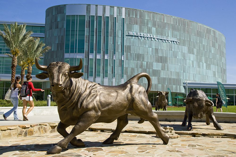
The University of South Florida has abandoned the unpopular lime green bull logo unveiled in September 2018, replacing it with the iconic Bull symbol that the university’s athletic department has used for almost 15 years.
Over the last few months, the university has been knocked in just about every media outlet and social channel possible, for the revitalized version of the logo. Complaints ranged from the new design looking too much like the logo of a well-known financial institution to a distaste for the lime green color scheme. An online petition at change.org recruited more than 7,500 signatures, calling to “keep the old logo.”
No matter the complaint, it’s no shock to see the change of a beloved brand met with resistance, especially with a very public seven-figure price tag. But despite the discord, the investment and now the reversal of the design, this first-impression situation might go down as one of the most successful university rebrandings of the decade.
Why?
To understand, we really have to go back to Branding 101.
There are many reasons an organization will choose to rebrand. Some of the most common include a significant change within the organization’s culture or story, an outdated design or brand confusion derived from a disjointed look and feel. USF had all of these elements in play.
First, the university has grown significantly in the last decade—most recently with the Florida Board of Governors designating it as a “preeminent state research university” bringing millions of dollars in additional funding, as well as the prestige of being one of only three in the state. This was the story USF told at the launch of the new logo.
What USF didn’t talk about at launch were the next two elements, which in this case, were probably even more important.
The old academic logo design was simply outdated, with a boring boxy layout. Granted, this pretty much defines about 90 percent of all university logos in the country. But with the university’s growth, and an organizational history of taking calculated risks, updating the design to something more modern and attractive to a younger generation of students not only made sense, it could be argued as a competitive advantage.
Finally, and probably the most compelling reason for the rebranding, was the muddled use of the logo. The number of different designs USF used was astounding. It had an academic logo, an athletic logo—which apparently was never intended to change with the new design, according to USF leaders—individual college logos, alumni logos, and the list goes on. This type of confusion is extremely common in companies which grow quickly, but it’s a critical flaw in the scalability of the brand that needed to be addressed.
With all of these pieces at play the choice to rebrand was a smart one.
As for the crash and burn of the new design, many reasons were speculated. Some said the community of USF students and alumni weren’t consulted. Maybe that would have helped. Some said the history of the university wasn’t given enough reverence. Whatever the case, the design was developed, launched and chaos ensued.
But it was eight months of beautiful chaos.
Sure, the university had quite a headache to deal with. Raging emails coming in from every direction, tweet-rants flared and other media hellfire scorched, all while proceeding with substantial investment supporting rebranding elements, including new advertisements, sign replacements, updated billboards and more.
What was most important, though, was that people were talking. Lots of people.
Many articles were written by local and national media outlets alike. Thousands of social media posts were shared. Millions of people all talking about one thing—USF.
If the university had played it safe and simply updated all of its confused logo designs to the iconic “Bull U” with a new modern font treatment, no one even would have even noticed. In the design retraction statement, USF vice president of communications and marketing Joe Hice discussed the success of USF’s new ad campaign titled “A Future Without Limits,” saying, “It is already paying dividends.’’
Of course, it is. But it isn’t the ad campaign making it happen. It’s the amount of earned media received from the affair that you simply can’t put a price tag on.
It remains to be seen if the university will fix the problem with the disjointed logo use but one thing is for certain: Although the success of the rebranding wasn’t traditional, the million-dollar investment was microscopic compared to the return USF will see from the frenzy, which put it on the map nationally. ♦

Lauren Davenport is a branding expert and CEO at the Symphony Agency in St. Petersburg. She travels the country helping corporations design and implement branding and marketing solutions to scale for rapid growth. She is a contributor for the New York Daily News and has been featured in Forbes, on PBS, ABC Action News, iHeartRadio, at the AmEx Open and more.
Thanks for noticing and sharing Lauren, smart writing as always! Go Bulls!!